Apply a drop shadow to an image in Canva and give some depth to your composition with these 5 easy steps + Tips to make it better.
This post may contain affiliate links. I may make a small commission if you purchase from my affiliate link at no extra cost to you. All my affiliations are hand-picked with the utmost sincerity. Read more about it here: Affiliate Disclosure
Can be done in Canva Free or Canva Pro.
Rose Cone featured in this video is in the Swanky Membership.
The first thing you want to consider is what you’re applying a drop shadow to. The following can have a drop shadow applied to it…
- Text
- Elements
- Photos
- Shapes
This method works with any of those, but some adjustments and tweaks might vary.
The 5 steps to add a drop shadow to an image in Canva
- Duplicate Image
- Adjust Image
- Adjust transparency
- Offset image
- Send to back
After duplicating the image in Canva, the first thing you want to do is adjust the image. What you do depends on the image, your needs, your desired look which is way more creative freedom than a “click to add a drop shadow” gives you. Even in Photoshop, I still use this method because there’s more science and creative forethought and it ends up looking either more natural, or better than natural, but in Photoshop I can blend layers and apply a brush.
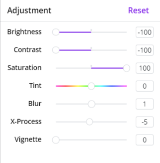
But in most cases, for most needs, with a transparent photo, I knock the brightness and contrast as low as possible or close to it.
Then up the saturation because I like the shadow to really compliment the color in the photo. DeSaturating to negative 100 removes all colors and gets you a more gray. But in real life, most shadows are not pure gray. Most shadows exhibit some dominant color, especially as the light bounces off things. And because the contrast is already knocked down, upping the saturation will still be grayed.
For the blur, you can go either way. Generally you want to look at the lighting.
“Hard light makes distinct, hard-edged shadows. Soft light makes shadows that are barely visible. A sunny day is hard light. A cloudy day is soft light. It’s that simple and that complicated.”
Nick Kelsh in The difference between soft light and hard light
So if you want the hard light look, or that’s already happening, you don’t want to add a blur, and to make it more edgy, you could reduce the blur into more clarity.
If you want a more natural, soft light look, or that’s already happening, you want to apply the blur.
Then you want to adjust the transparency and send it to the back.
Add a Drop Shadow to Text in Canva
For text, all you have do is
- Click on Text
- Click EFFECTS
- Click SHADOW
- and make adjustments
Add a Drop Shadow to SVG’s & Shapes in Canva
Some of the items in “Elements” in Canva are SVG’s that allow you to change the colors, and some not so much.
The ones that don’t allow you to change the colors you can adjust like a photo.
The ones that do allow you to change the colors, my suggestion is to change all the colors to a hue that feels like the shadow may come across that way. Then adjust transparency.
That’s great if you want a crispy shadow. But to Apply a Blur, you will then want to save the adjusted shape by itself. If you have the Pro version, you can save it as a PNG with a transparent background (recommended). If you have the free version, make sure the background color is the one you want to use and all the elements you want to blur are on it in the right locations.
Then upload the file as an image, put it down in the graphic, and click ADJUSTMENTS to get to the blur setting, and blur. Then move to the back and adjust transparency.
Drop Shadow Tips
Pay attention to the Light
If you are mixing elements together or adding them to an existing photo, or adding text to an existing photo, you want to think about how light plays with the other elements, and most of the time, mimic that. …though sometimes with text over a photo, you may want contrast just to make one stand out more than the other by doing the opposite of the other elements.
Things to look for | Things to Plan Out when applying a drop shadow to an image in Canva…
- Light Source
- Primary hues you see in the shadows
- Warmth vs Cool (or blues vs yellows)
- Hard Light / Soft Light – How crispy the shadows are and dynamic the contrast
Sometimes it helps to find photos that portray the vibe and look you’re hoping to achieve, and then overanalyze the light and shadows. It helps too to desaturate to see the level of contrast the colors have, which also makes it easier to see where the light is and how it’s bouncing off objects.
My Color Hack
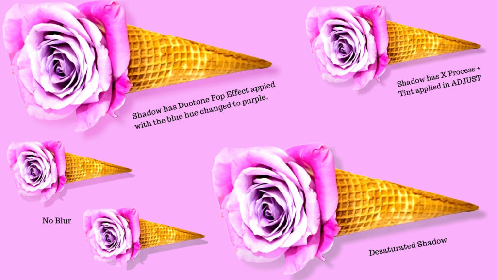
I like to make lots of images on bright colorful backgrounds, and most of that I end up doing by hand. So when I apply a drop shadow to an image in Canva, I never use a black / white / gray for shadows. It’s more colorful and vibrant if you use color in your shadows (sometimes overplaying the color).
What I do instead is I want to aim for a color similar to the background, that vibes well with it. Sometimes a darker color burn effect.
For Photos, you can do a Photo Effect in Canva such as duotone or color mix, and aim for a color that vibes well with the background. You can also double click the 3 lines with dots on them after the effect is applied to adjust the colors.
For shapes, use the same color, and then go to choose New Color in the palette and go darker, sometimes a gray version of it.
Just play around until you find the brightest color that looks the most natural.
Instead of a Drop Shadow, what about an Actual Shadow?
A lot of times, you don’t want the shadow applied to the entire image. Sometimes you want the shadow underneath the image but not behind. Like if you had a can of soda on the table, it’s not going to have a shadow go all the way up the entire can. It would set off a shadow kind of warped along the bottom of the can.
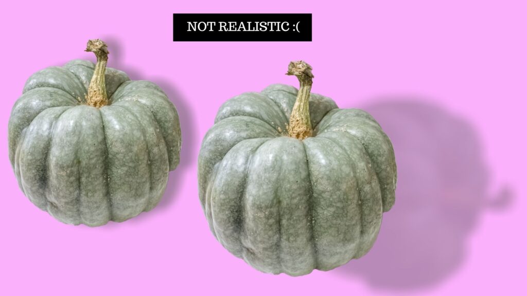
So the easiest way to handle this is to go to Photos. Search any of these search terms…
- Blob
- Paint Stroke
- Brush Stroke
- Watercolor
- Specific Shapes like Cylinder
Find something that resembles the shape of the shadow you want to aim to achieve.
Definitely aim for a PNG with a transparent background to make your life easier, though if you have Canva Pro, you can remove background.
Canva does not seemingly allow you to warp a photo. Of course, in Photoshop, you can copy the photo and hold down the CTRL key and warp it into the size you want. Squish it. Stretch it. Or brush in the shadow.
But since we cannot warp a photo or draw with a brush in Canva, we’ll simply have to settle for this.
For here, I searched Blob.
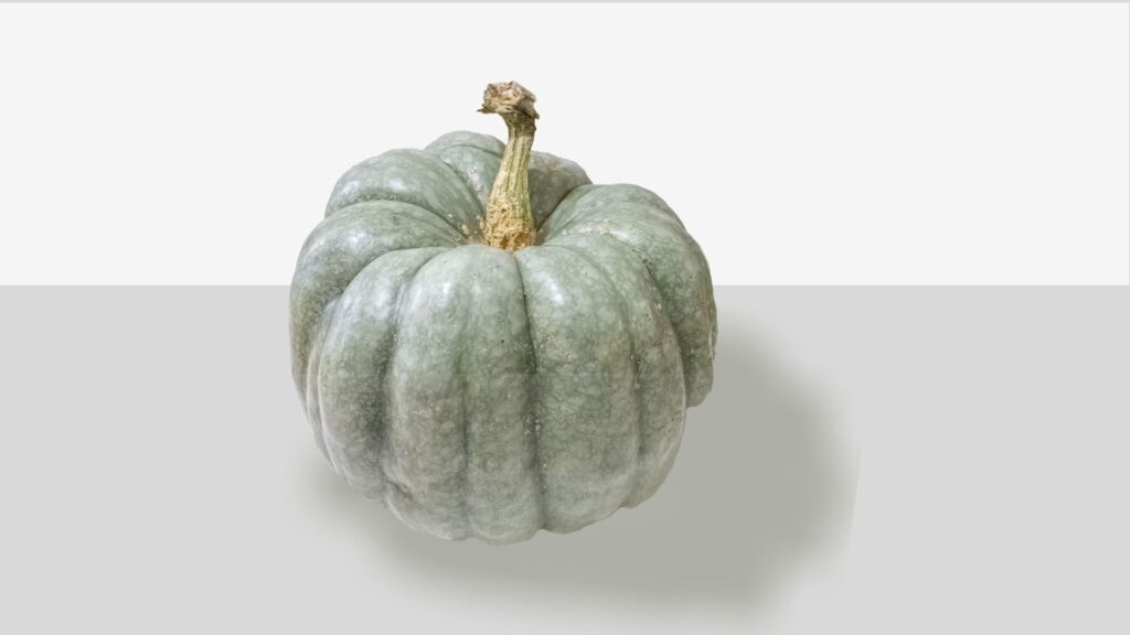
Then I rotated it. Based on where the light is hitting the object and the shadow is created. Technically, this pumpkin would probably realistically have several shadows.
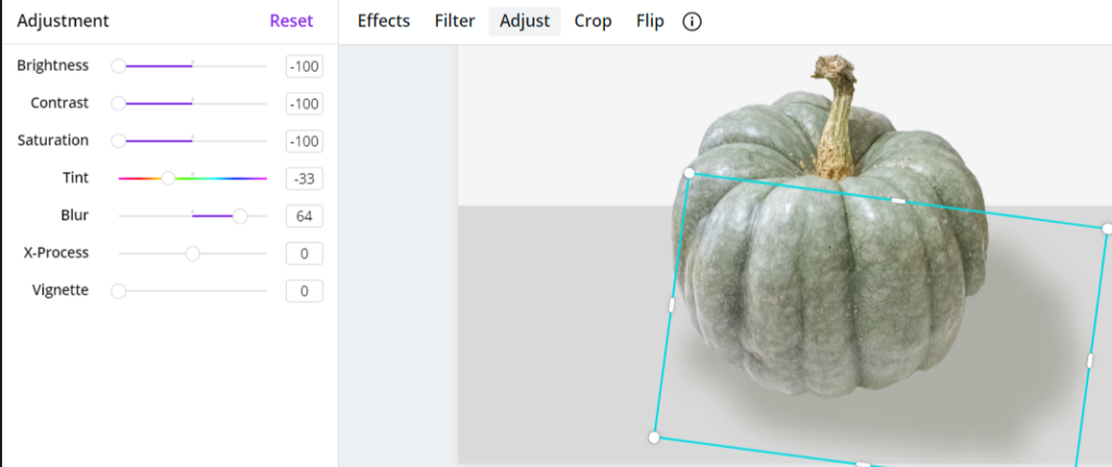
I made those adjustments.
Then I felt the pumpkin bottom was too much for the shadow, so I knocked down the transparency of the pumpkin to where it made sense along that bottom line. Then I copied and pasted it directly on top of itself, and the top one, I upped the transparency but not quite to 100. Then I cropped out the bottom up to a point in the pumpkin where you can least there’s a cropped version on top of it.
If you look closely you can see that line, but it still looks better and you work with what you got.
In Photoshop, I would probably have applied an adjustment layer mask. If I were to do this transparency game, I would just erase with the softest brush.
The Upside Down Approach to applying a Drop Shadow to an image in Canva
The one time a shadow doesn’t seem to skew much from the original dimensions of an object is when the shadow is directly underneath it, reflecting, upside down. Of course, this is all relative.
But one idea to get around the shadow blob without a full on drop shadow is to simply rotate the image upside down and make adjustments and change transparency.
The lighting doesn’t always make sense, so it may not work. But some images you can get away with this.
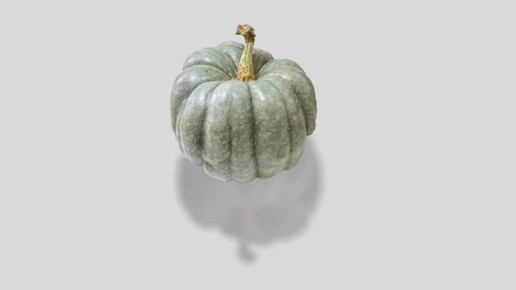
Take-Away
The important thing is that it’s possible to apply a drop shadow to an image in Canva, and now you have several creative methods and ideas to make that happen for you.
If you plan on using Canva a lot and do not use other software like Photoshop, I truly suggest going Pro. I have the Adobe Creative Cloud where I use quite a few Adobe products (and I recommend those just the same), but I supplement with Canva Pro because it’s less tolling on my computer, faster to work with, and it’s great for social media quickies.
Of all the features you get extra, the ones I use the most are Pro Photos and Elements, the Background Remover, the extra fonts and ability to upload your own fonts. I also utilize their branding styles / brand kits. Honestly, I don’t even notice it’s coming out of my account every month.