
Google has too many fonts, but these are some of the best Google fonts that Google has to offer.
When it comes to websites, especially WordPress sites, Google fonts are probably the easiest way to go with fonts because you don’t have to worry about the license, and they load well on other people’s computers.
But which fonts?
Best Google Fonts
There are several incredibly popular fonts that look amazing on all websites, especially as copy/paragraph fonts, like
- Raleway
- Montserrat
- Open Sans
- Roboto
- Merriweather
You really can’t go wrong with those…
But there are some prettyish fonts you can be using as well.
If you’re curious, instead of Lorem Ipsum, I decided to use various passages from T.S. Eliot’s Poem, The Love Song of J. Alfred Prufrock.
The Ultimate Best of Google Fonts
I really think Montserrat probably wins this because of its popularity, but I really love the craftsmanship of Vidaloka.
What to Look for in a Font?
So many factors really go into play, but you want to think about your purpose, and ideally, aim for one that has the most options.
The best fonts for options are variable fonts (meaning you can change its weight to a specific number). The second best ones come in a lot of weight options.
But that doesn’t mean we ignore fonts that have only one weight.
The other things I like to look for are kerning, how easy it is to read and understand, and the crispy feel of it. Plus I aim for pretty.
Vidaloka + Trocchi
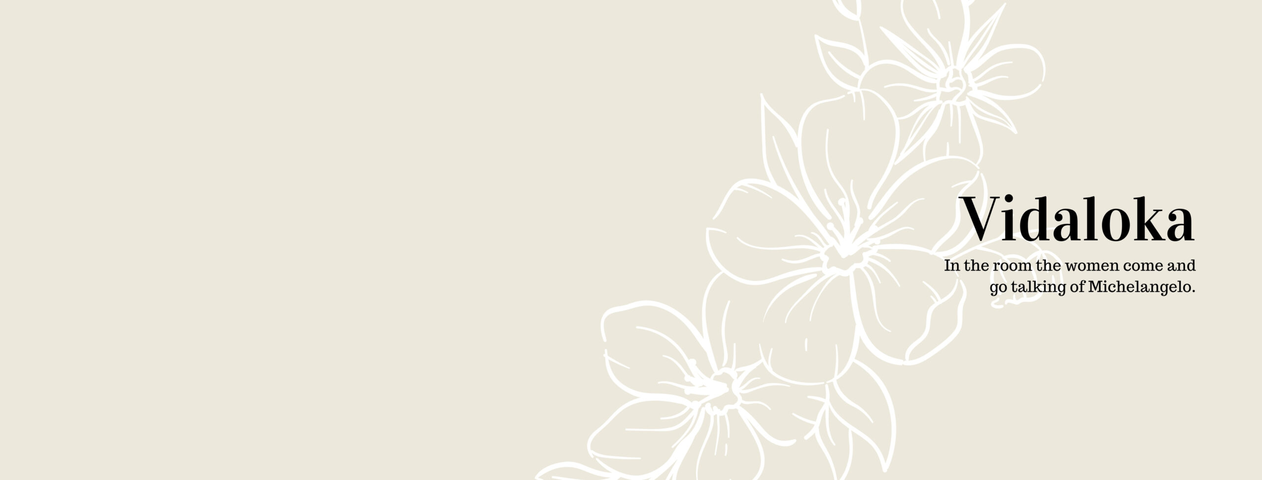
Vidaloka is probably my most favorite font in Google simply because it’s one of the smoothest serifs I’ve seen.
Plus it has a high contrast, a feature common in Didone typography, where the ups and downs are thick but the lefts and rights are thin. A lot of feminine sites are using modern twists to didone typefaces, but Vidaloka is easier to read than some of the ones out there. I go crazy when you can’t see one of the lines in the capital E.
While I do usually love it teamed up with a sans serif, I played around a bit and I quite like Trocchi. It just rather seems like a classy duo.
Cinzel
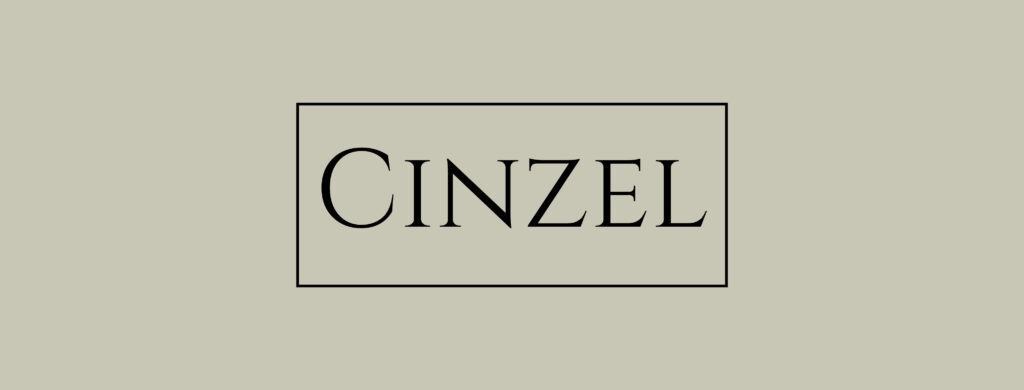
It’s a timeless classy look that reminds me of fashion and watches, but Cinzel is really some modern twist to first century Roman inscriptions. I’m not sure I’d use it on a website, but it sure is decorative. It’s all caps like above.
Gayathri + Ubuntu

Gayathri. This modern Malayalam typeface is usually recommended as most suitable as a Display, as in a Heading or Main text in a poster; however, I personally think it makes a great copy font. Bold is easier to read in size 18, but I’ve noticed a new trend with fonts that look “squished” as copy fonts.
Ubuntu, the smaller font in the pic above, is total open license, meaning you can make fonts from it if you wanted to. It was meant to be designed for computer screens, so it’s fairly easy to read in various languages and various sizes.
DM Serif Display + Red Rose

DM Serif Display is a high contrast transitional typeface. You can also find a lower contrast with DM Serif Text. I would recommend using the Display version for GIANT use of text, and the Text version for most reading situations.
Red Rose feels kind of robotic to me (not much of a rose I suppose), but it is easy to read and has a friendly height to match Display text that is “shorter” feeling.
Prata + Cardo

Another high contrast didone typeface (similar to Vidaloka mentioned earlier), Prata has a classy feel to it.
I love how Google describes it, “Prata is an elegant Didone typeface with sharp features and organic teardrops. There is a certain tension in the contrast of its virile serifs and soft refined curves. Its triangular serifs complement and accent the thin strokes, and the high contrast means it will work best in display sizes.”
It just sounds like the font is on a catwalk.
Definitely one of the best google fonts.
But because Prata is best for display, it pairs up nicely with Cardo’s Biblical appeal. Cardo features the quality of professional typography in Old Style form.
Poiret + Quicksand
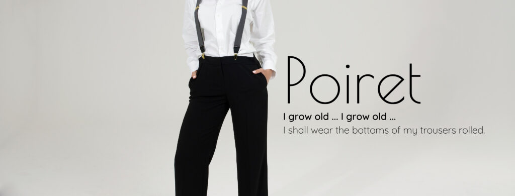
From Google Fonts,
“A fresh decorative geometric grotesque with a hint of Art Deco and c‘onstructivism. Poiret One is a unique typeface with light forms and pure elegance. Sleek and simple. Based on geometric forms, it has stylish lines and graceful curves. The font is applicable for large signs, labels, titles, headlines and any type of graphic design on the web, in motion graphics, or in print – from t-shirts to posters and logos.
It is also well-suited for short texts and advertising where style is desired. Complete with a lower-case letters, the Poiret One is also useful for all-caps usage.”
And using geometric shapes as its core foundation, Quicksand is more doable for smaller fonts pairing well with Poiret.
Abril Fatface + Nunito
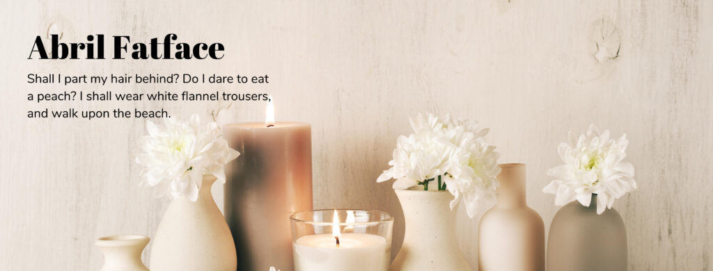
Of course I love Abril Fatface as its my primary font here on SwankyStock. Inspired by 19th Century British and French Advertising posters, Abril Fatface is a Diadone-styled font featuring stark contrast between thick and thin strokes with the modernism of smooth tear-drop, paisley terminals.
Nunito is a well balanced sans serif with incredibly rounded terminals (Nunito Sans being more crisp sharp terminals). This is probably one of the clearest fonts I’ve ever seen making it perfect for incredibly small fonts that you want people to be able to read easily.
Nunito Sans Black + Nunito Extra Light
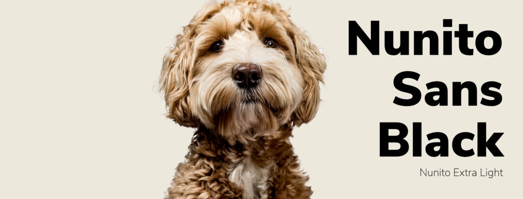
Since we just discussed Nunito in the last one, let’s look it at closer because there’s some perfection at play here. This one can arguably be one of the best google fonts ever.
Nunito Sans has the sharper more squared terminals making it a great headline font. It just reads so clear.
Nunito Extra Light is a really thin version of Nunito with the rounded terminals that looks amazing small.
Nunito comes in 14 styles, and Nunito Sans comes in 14 styles giving you 28 different fonts to work with for one typeface.
Francois One + News Cycle

So you take a goth display typeface, open it up so it looks better on computer screens, and then slant the terminals for a playful look and you get Francois One.
Reviving 1908 era News Gothic, News Cycle is designed to be readable small, and look ravishing large. I also like this one paired with Open Sans Light.
When looking through Google fonts for the Best Google Fonts, I paired these two together without realizing they were both Gothic fonts.
Anton + Montserrat
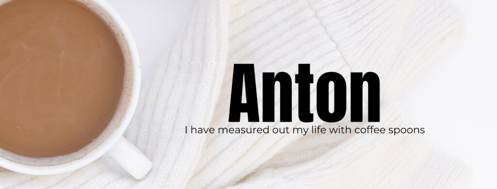
Just look at how beautiful those two go together. I love the contrast: Heavy vs. Light. Tall vs Wide.
Anton is inspired by advertising posts, but tweaked for computer monitors. It comes in one weight. Super bold.
Montserrat (named after a neighborhood in Buenos Aires) captures the beauty and life from vintage Buenos Aires travel posters. Its sister font Alternates has a more rounded look rounding out a lot of the V edges and adding a slant to the e, and Subrayada features a special style of underline found in the Montserrat neighborhood (the underline touches the letters and disappears & reappears as the bottom of the letters open like M, N, K, R…
On the internet, Montserrat has become the face of beauty & class. When in doubt, use Montserrat. Add flowers.
Really you can’t go wrong because it has so many styles. Montserrat comes in 18 styles, Alternates has 18 styles, and Subrayada comes in 2 styles.
Playfair Display + Arapey
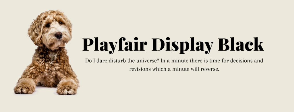
Playfair is a variable font meaning you can adjust its weight to an exact number. It’s pretty super easy to read and still has a classy vibe.
I don’t normally see a “pairing” recommended within the description on Google fonts, but this one had one, and probably worthy of pairing, but whoever wrote the description thinks it would go well with Georgia.
But Georgia is not a Google font, so we’ll pair it with Arapey.
Arapey, proncounced Ah Ra Pay, named after a small town north of Uruguay, reminds me of a more modern version of Old Standard.
Alice is another font that will pair well.
Archivo Black + Comfortaa Light

Derived from Chivo, Archivo (and archivo narrow & archivo black) features a high performance typeface ideal for both computer monitors and for print. All 3 fonts combined make a total of 17 styles.
Pair it with Comfortaa, a variable font. Comfortaa is a rounded sans serif geometric type meant to be more for headlines, but I love it as a small copy font for ads. I’m not sure I’d want a website with this as a copy font, but it’s super rounded vibe really does make it, like the name suggests, comfortable to read.
Ultra + Lora
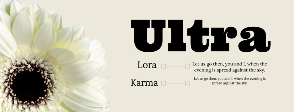
Ultra reminds me of a modern Cooper Black. It’s the most Cooper looking font in Google.
From Google Fonts, “Ultra is an ultra bold slab typeface with nods to wood type styles like Clarendon and Egyptian. Strong and dramatic letterforms for titling, a serious, yet friendly, and easily legible typestyle. Perfect for power headlines and titling for impact.”
Also similar to Cooper Black is Corben Bold and Coustard Black.
At first I kind of like how it paired with Karma, but I feel like Lora is a more polished pairing. Lora may as well be one of the best google fonts because of its vast variety of use.
Lora is a variable font, well balanced, perfect for small and large text, and perfect for both screen and print. It is unique because it has some calligraphy appeal with the curves, but it’s still slabby serif.
Wrap it Up
Google is a treasure cove of fonts that are ideal for screen use. It’s just overwhelming to look through them. I could spend hours pairing 2 fonts for a website.
Trying to find the best google fonts was kind of a daunting task because I fear I overlooked some other gems in there.
I would love to hear about your favorites.

Interested in Joining the Membership?

These are some great pairings for those who are starting to experiment with graphic design. There are so many options, it can be completely overwhelming for those who are getting started. However, this gives people a great point to get started with combining fonts, showing how fonts can work together in a complimentary way. Thank you for putting it together. There were a couple here that I had completely forgotten existed!